Manchester Literature Festival

A decade of literature

We love a good book at Mark, and we’re proud of our home city. So not many of our achievements give us more satisfaction than our long and happy relationship with the Manchester Literature Festival (MLF). This year, we notch up a decade together. The secret of such long-term success? Partly, at least, it’s because we’ve taken a really bold approach. Early on in the partnership, we created a powerfully bookish visual identity to help set MLF apart from the ever-proliferating plethora of book festivals across the UK. But in terms of each year’s promotional campaign, we have started with a blank sheet of paper, creatively speaking. The result, we hope you will agree, is 10 campaigns (so far), each based on a compelling creative “storyline” of its own, but all adding up to a coherently undputdownable continuing narrative…

What we did

Brand Identity
Brand campaign
Brand communications
Digital
Creative direction

Collaborators

Richard Moran (2012)
Henry Iddon (2010)

2016

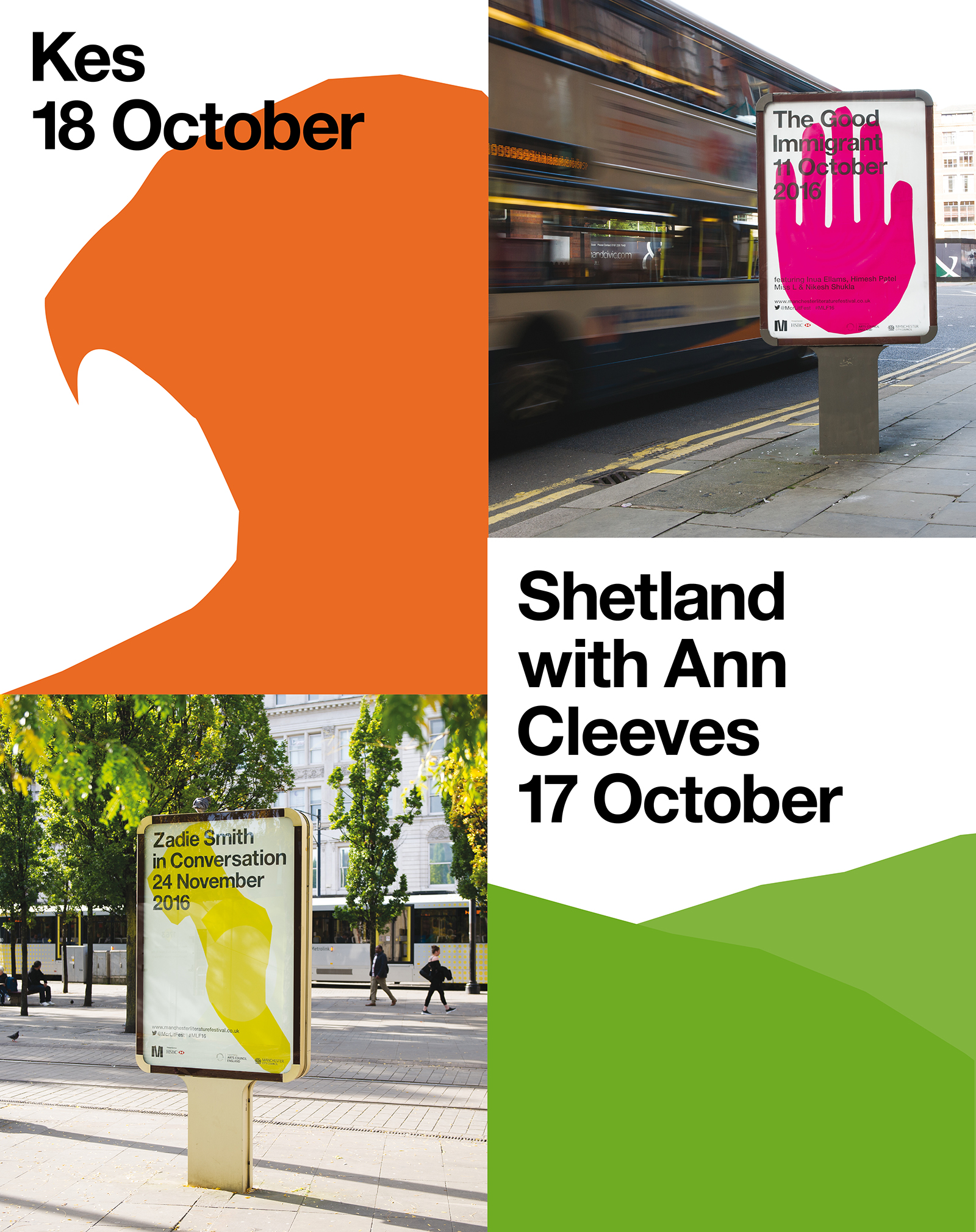
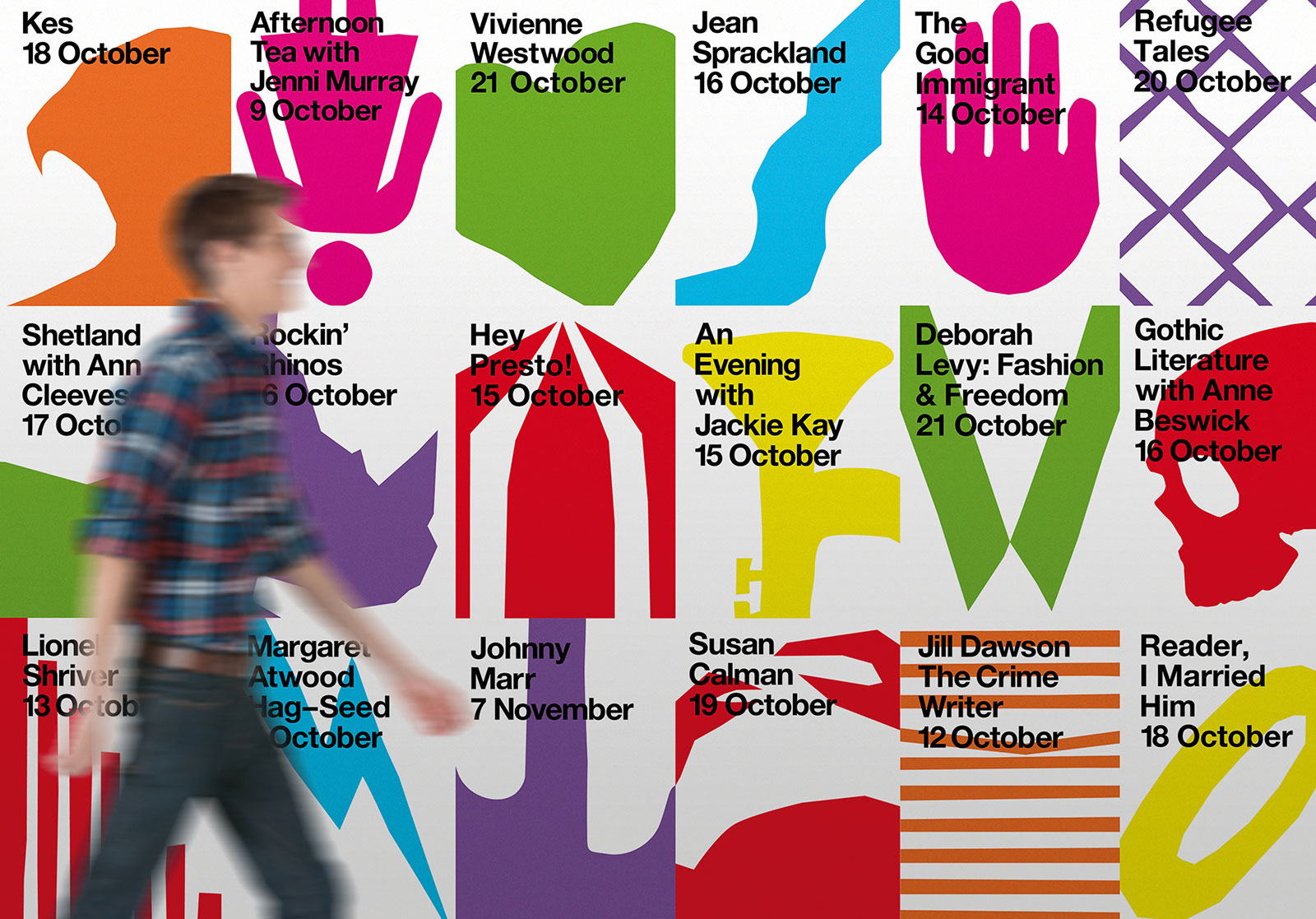
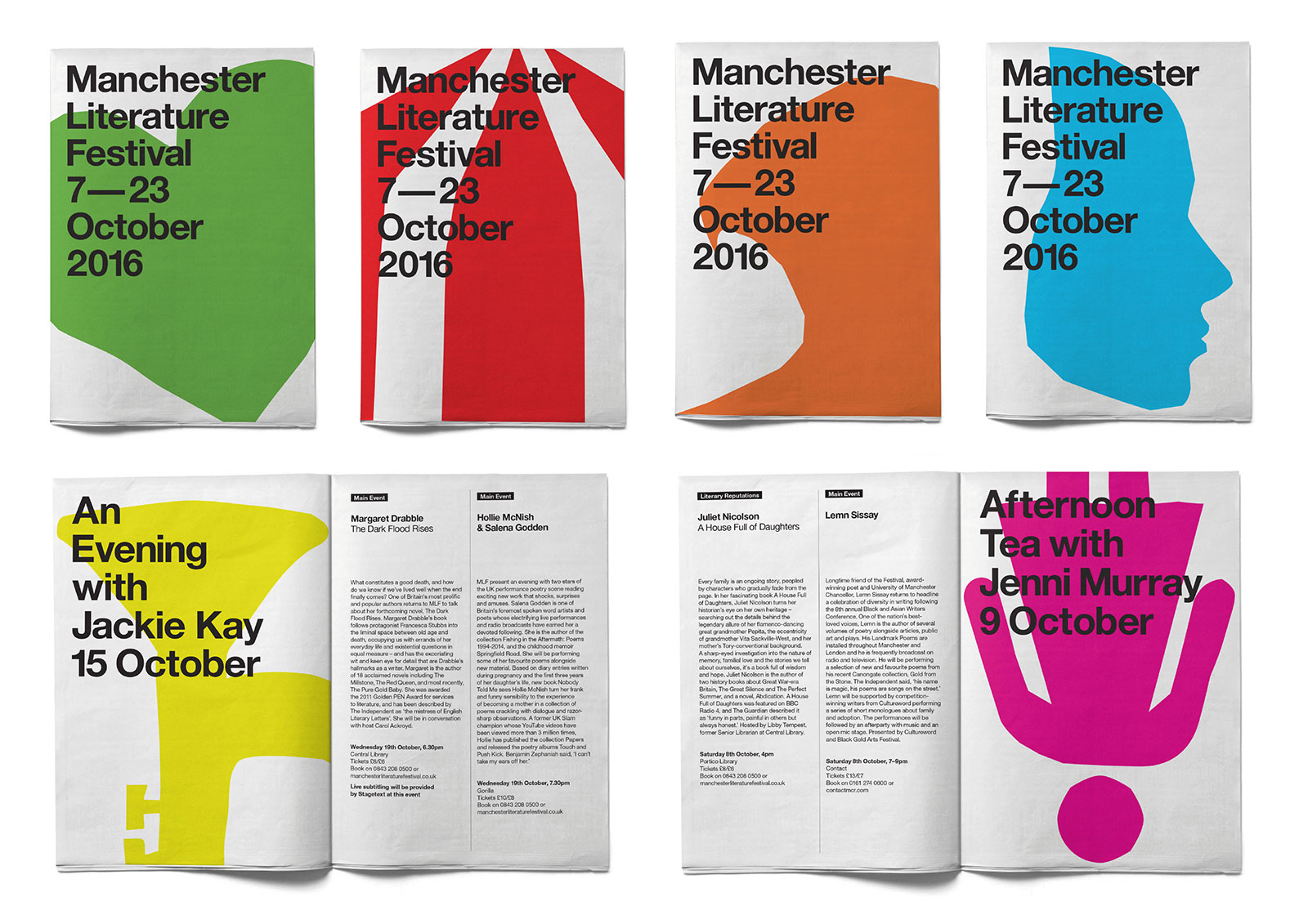
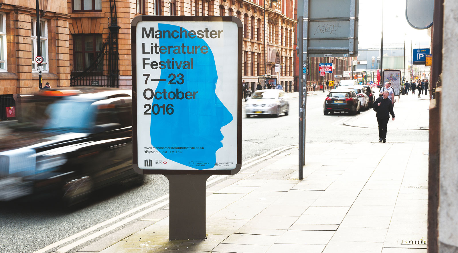
The 2016 Festival featured some iconic names, including Margaret Atwood, Zadie Smith, Vivienne Westwood, Jackie Kay and Ian McMillan. We reflected the cutting edge nature of the line-up with a disarmingly simple and colourful suite of illustrations, created and inspired by using cuts of paper (a knowing nod to the traditional book format), to represent the diverse array of events.

2014

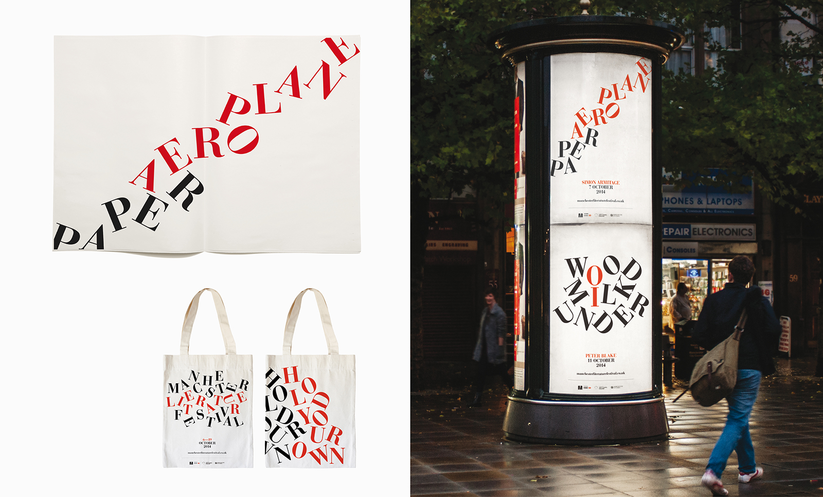
As the general theme of this year’s festival is ‘reinterpretation’, we took a graphic spin on this and devised a reductive typographic look and feel, using remixed letters to create simple, playful typographic illustrations.

2013

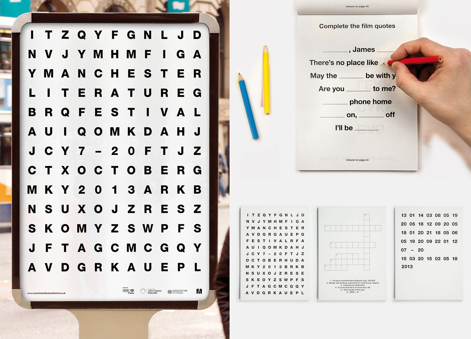
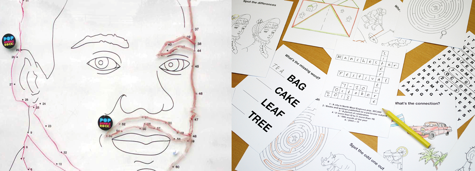
Tackling this brief for the seventh successive year, we might well have been left scratching our heads, unable to see the right solution. But luckily, inspiration struck and it suddenly came to us: why not base the campaign for the 2013 Festival around an interactive puzzle theme?

2012

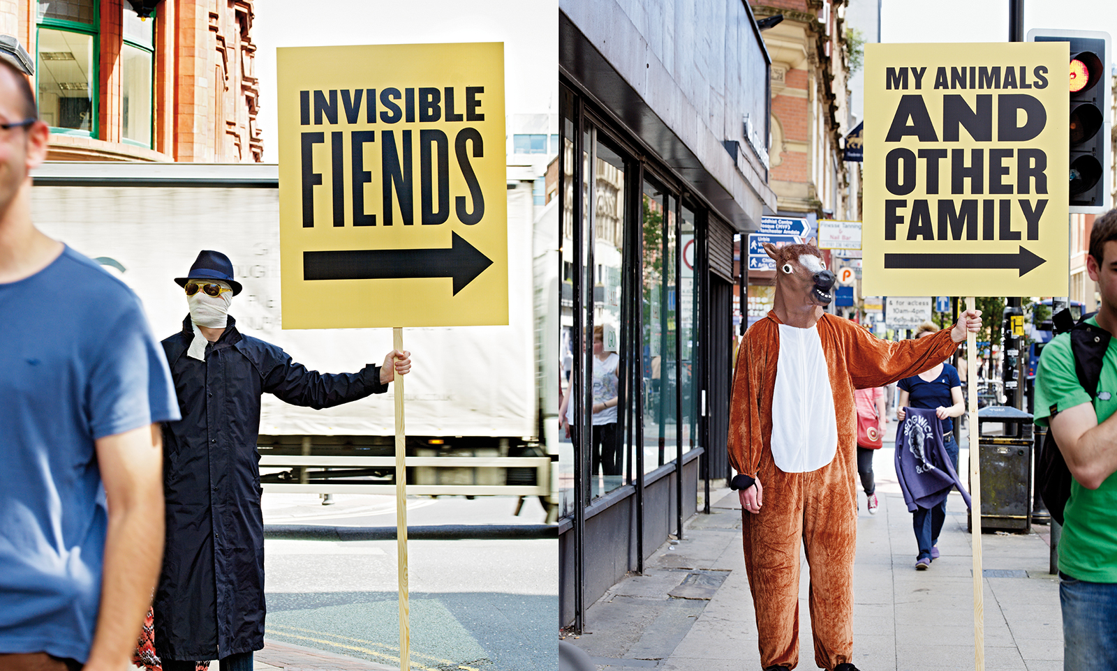
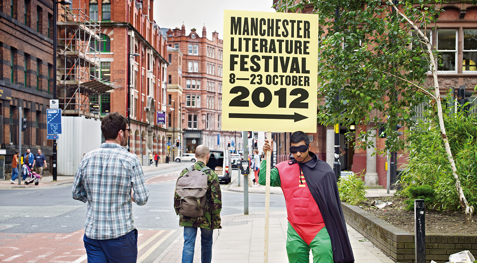
For our sixth successive MLF campaign, we decided to fly in the face of convention and use ultra-tacky “Golf Sale” type signs, brandished by miserable -looking folk in rubbish costumes – who also acted as human signage at each event.

2011

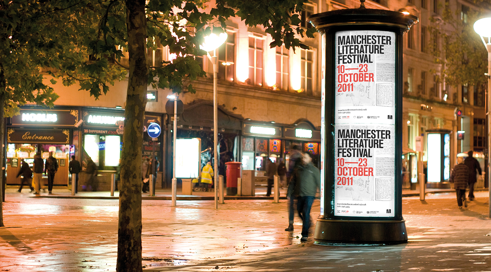
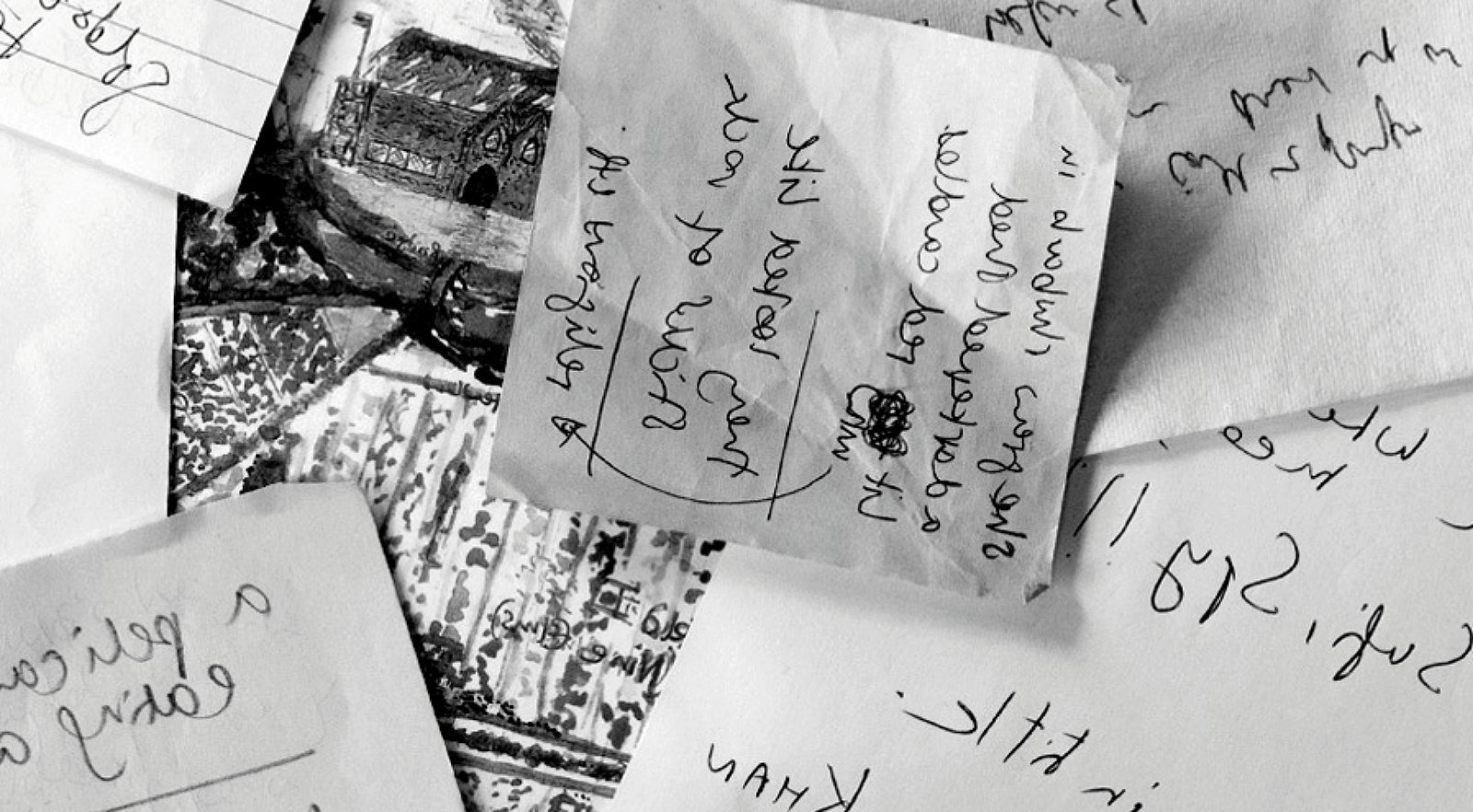
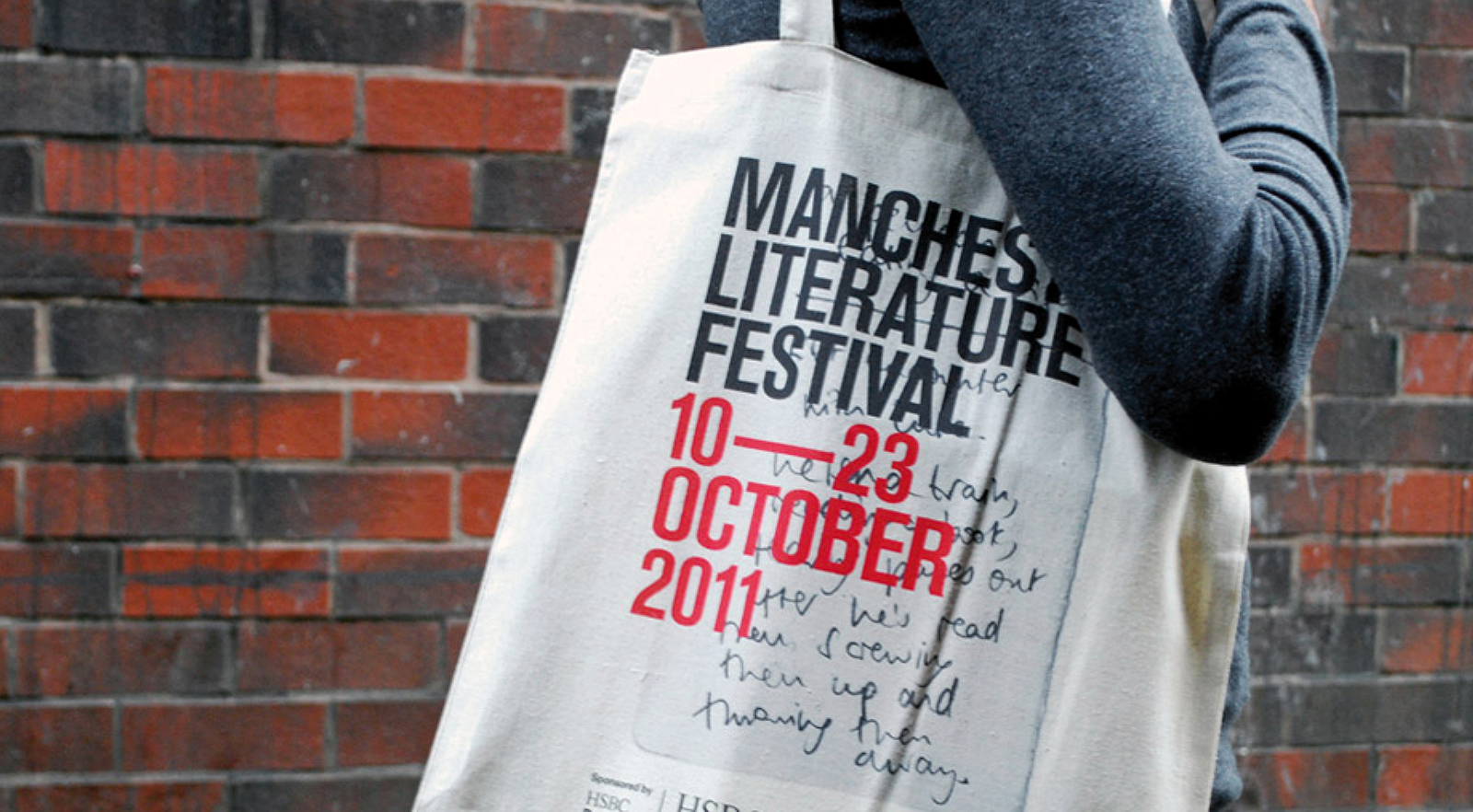
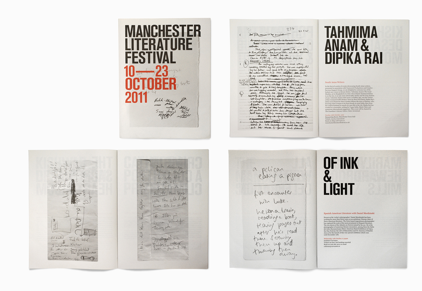
For the 2011 Festival, we asked each featured author to submit an example of their “work in progress” – notes, plot outlines, ideas scrawled on the back of an envelope, whatever. Piece by piece, we built up a fascinating mini-archive, which we deployed across the various items.

2010

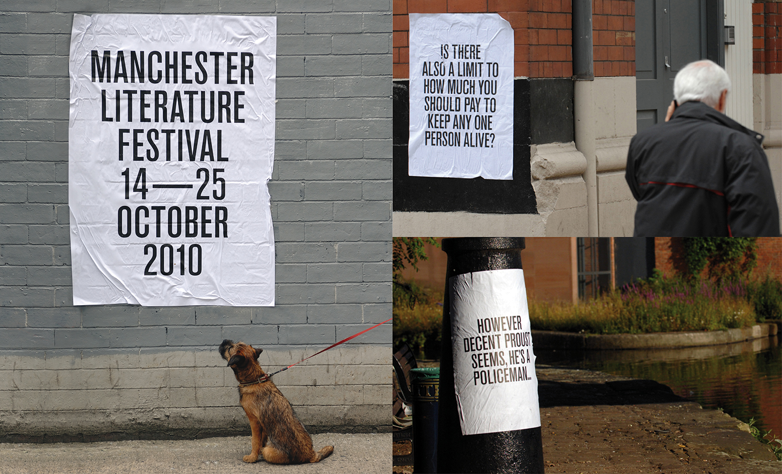
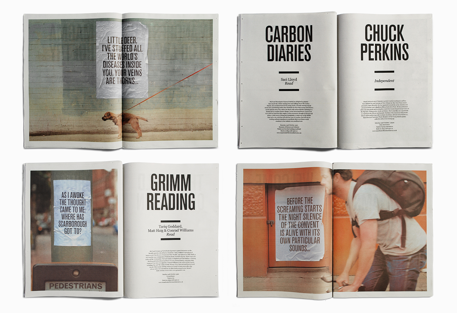
This time, we let the writing do the talking. We chose powerful extracts from the work of writers taking part, and pasted them up on posters around the city – creating a strong sense of intrigue among local book-lovers, in the run-up to the Festival. Photographs of these posters in situ then became part of the identity across all promotional materials…

2009

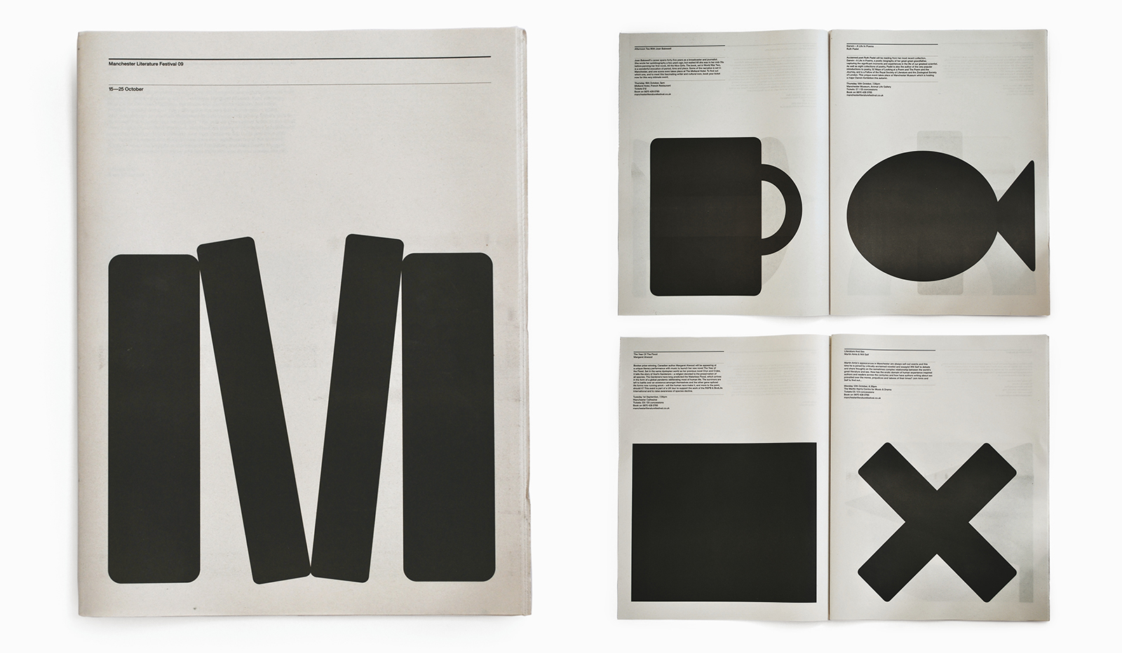
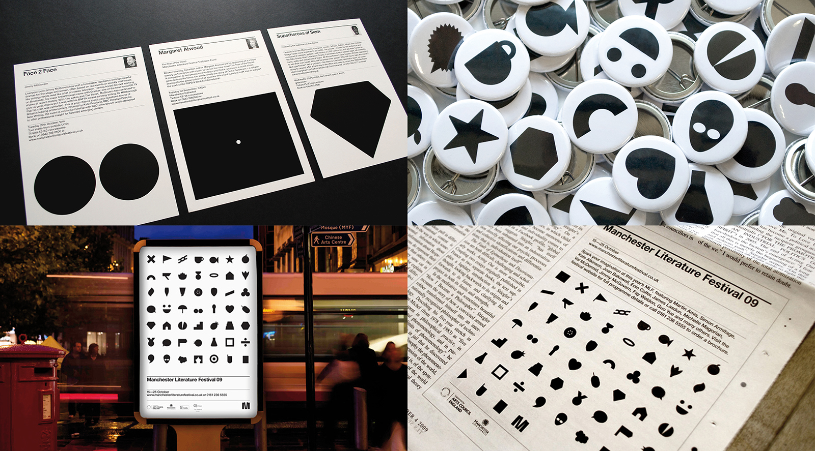
Building on the boldly bookish identity we created for the Festival in 2008, we decided to assign each writer attending the 2009 edition with a graphic icon, metaphorically representing their work. Together, these icons became the campaign identity, wittily applied across a wide variety of communications.

2008

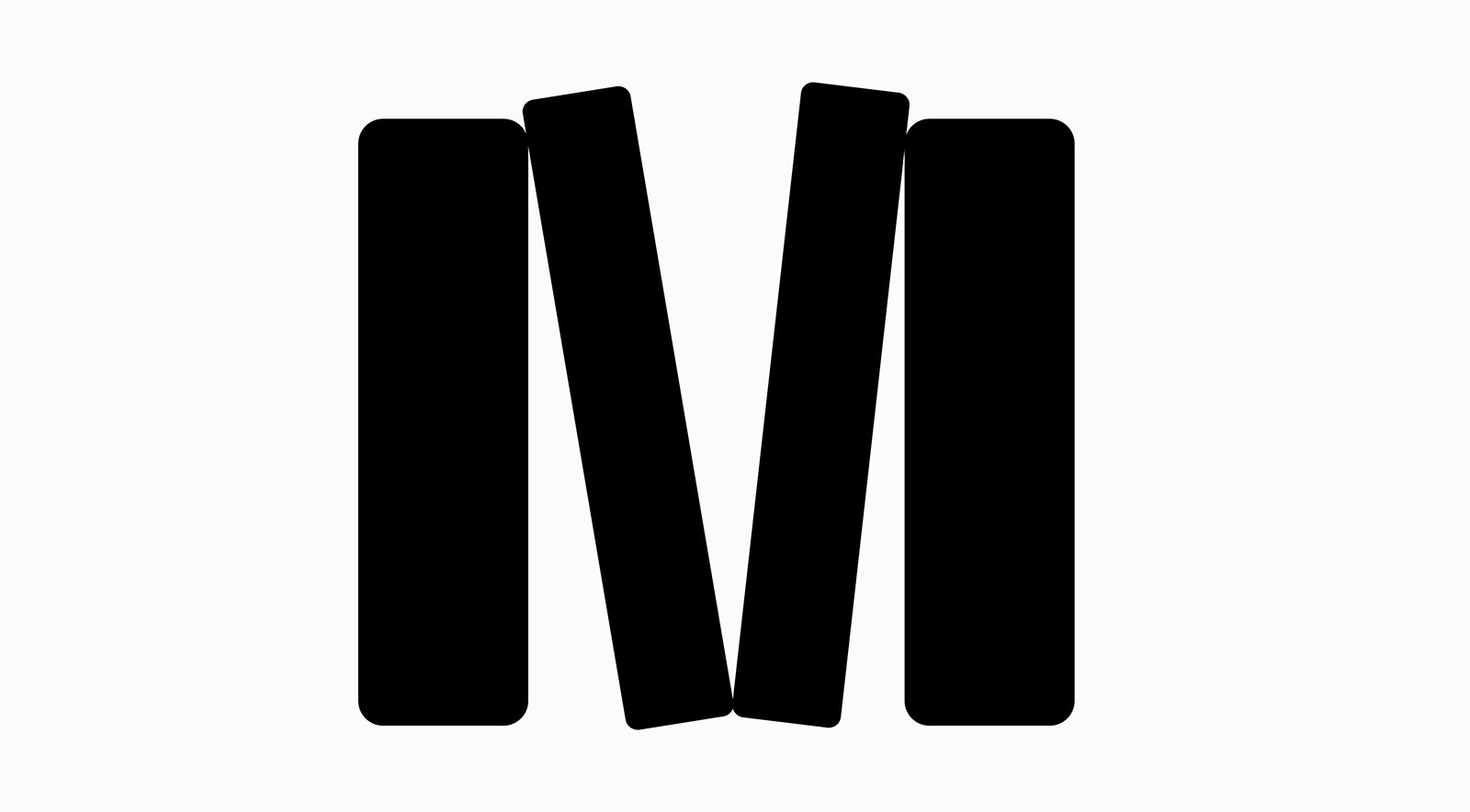
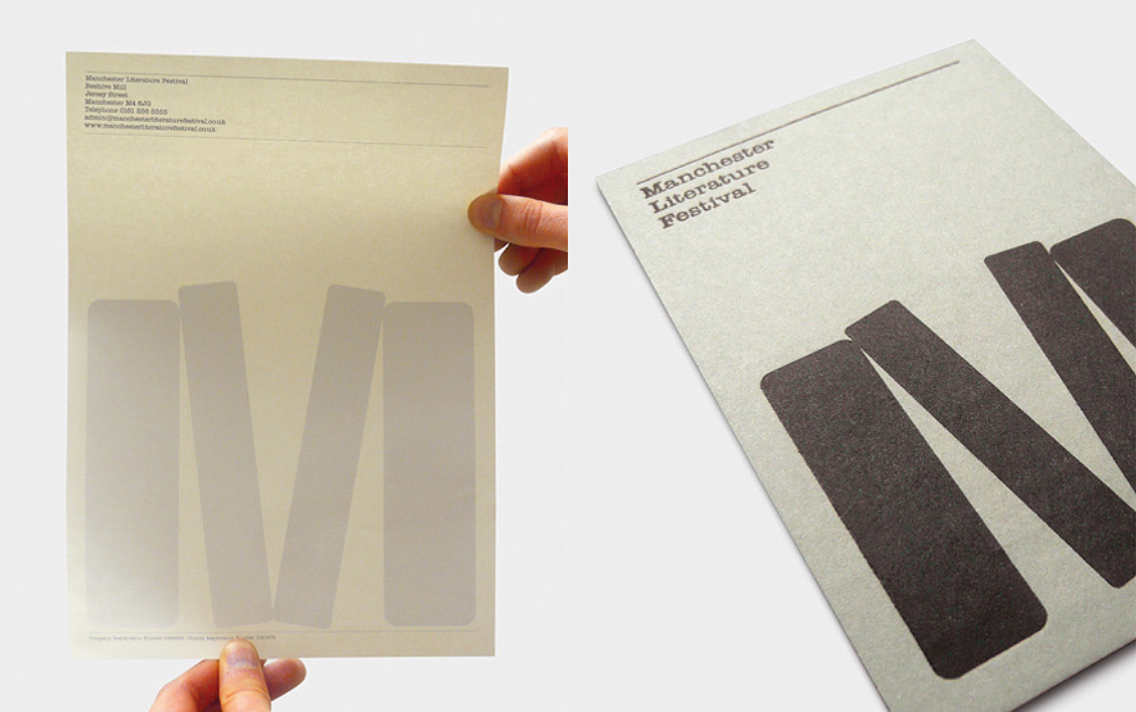
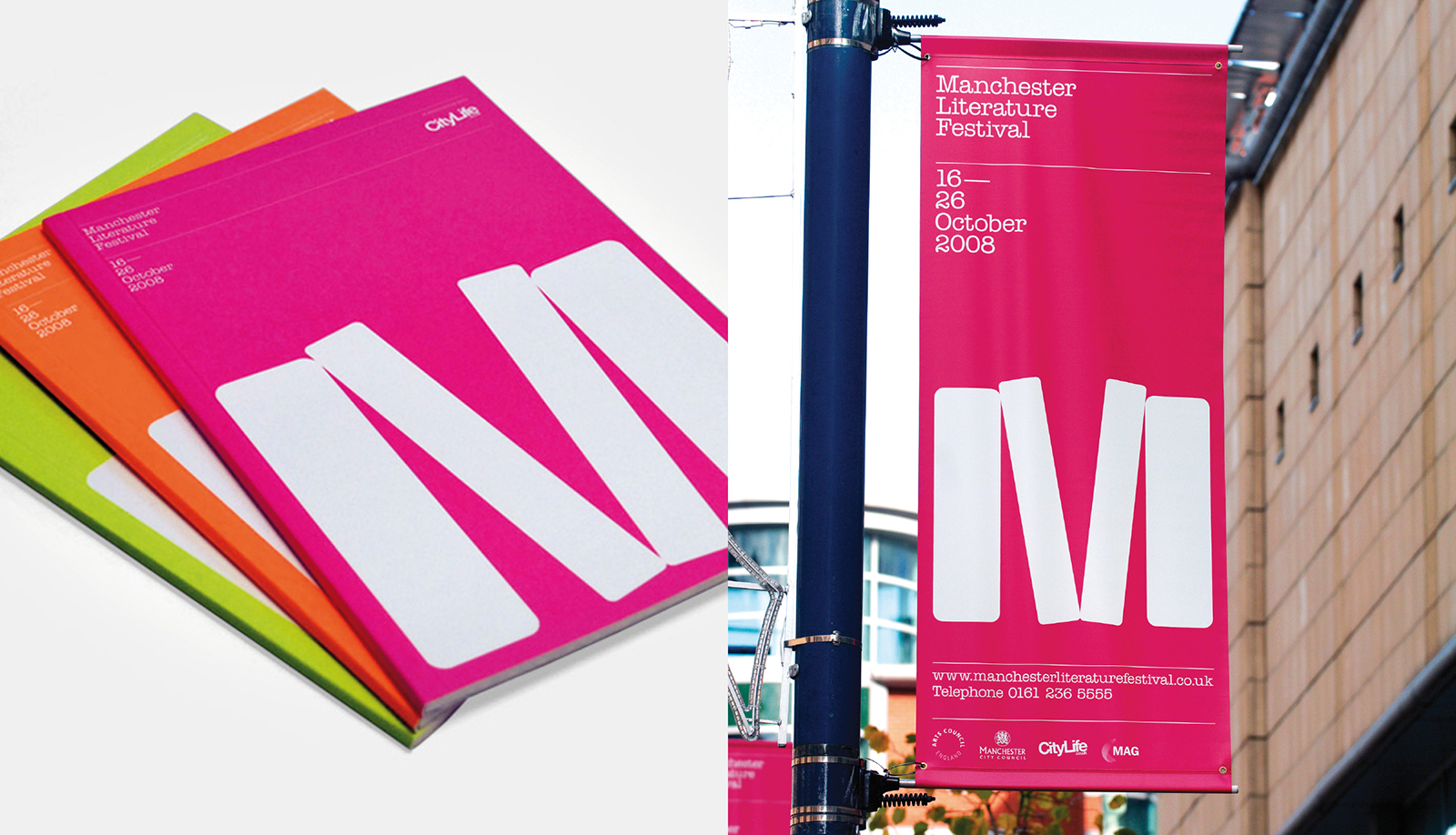
Our big idea for MLF’s new identity – and the 2008 campaign – came to us while staring vacantly at our book-shelves…

Date

February 14, 2017